- Home
- About me
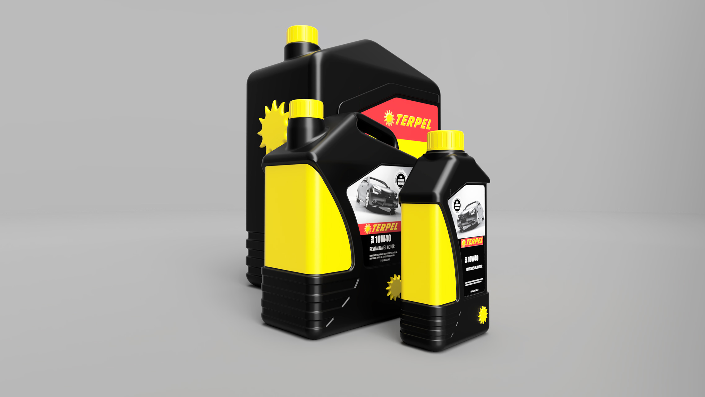
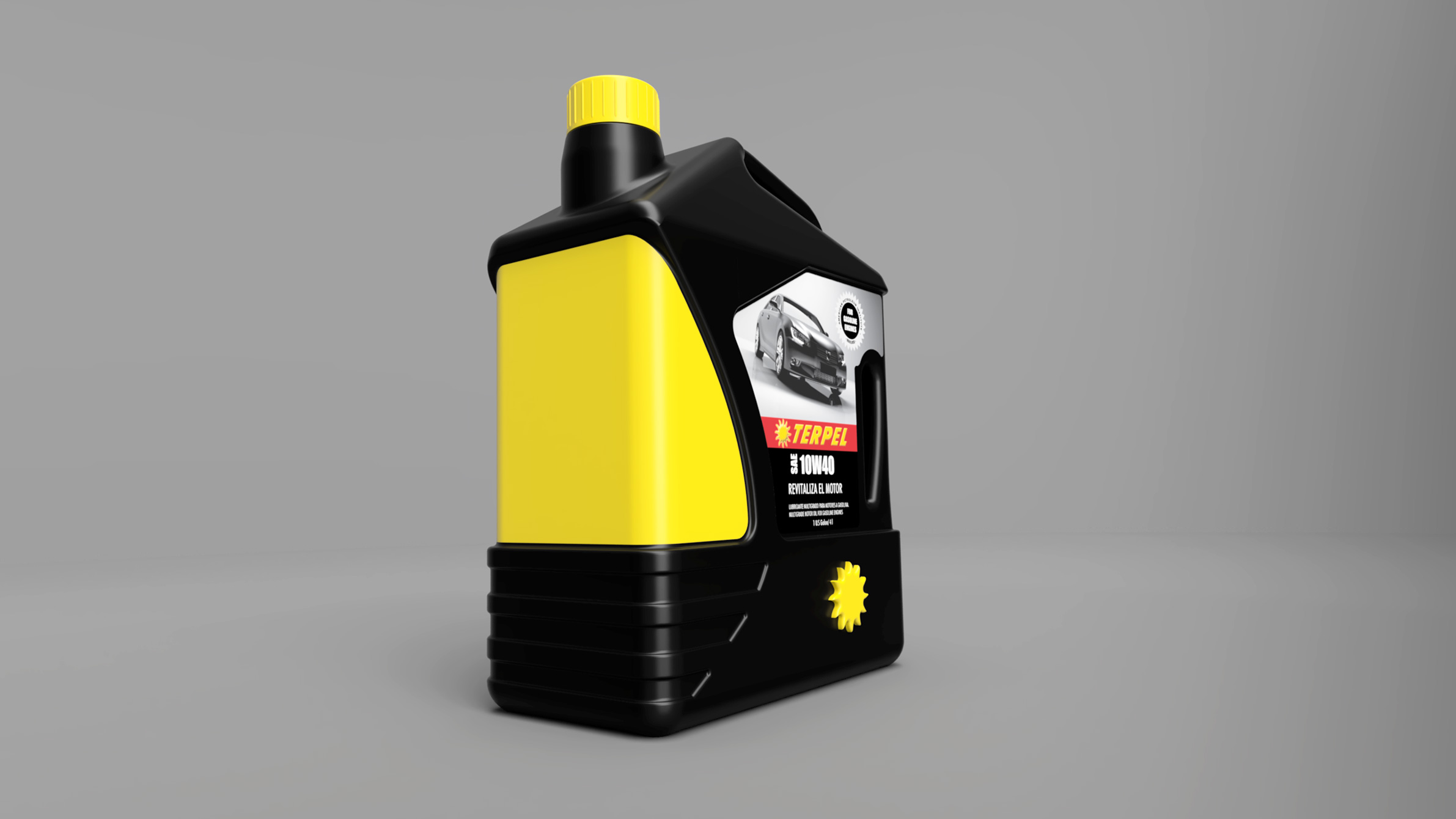
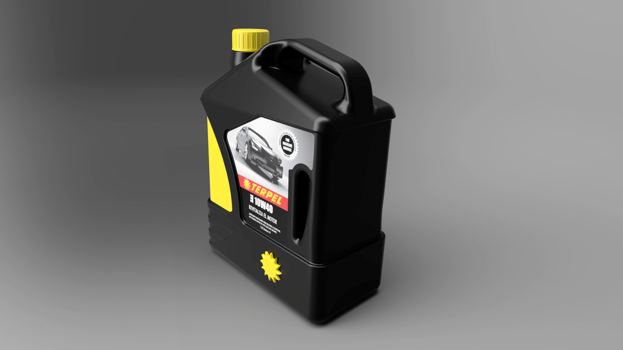
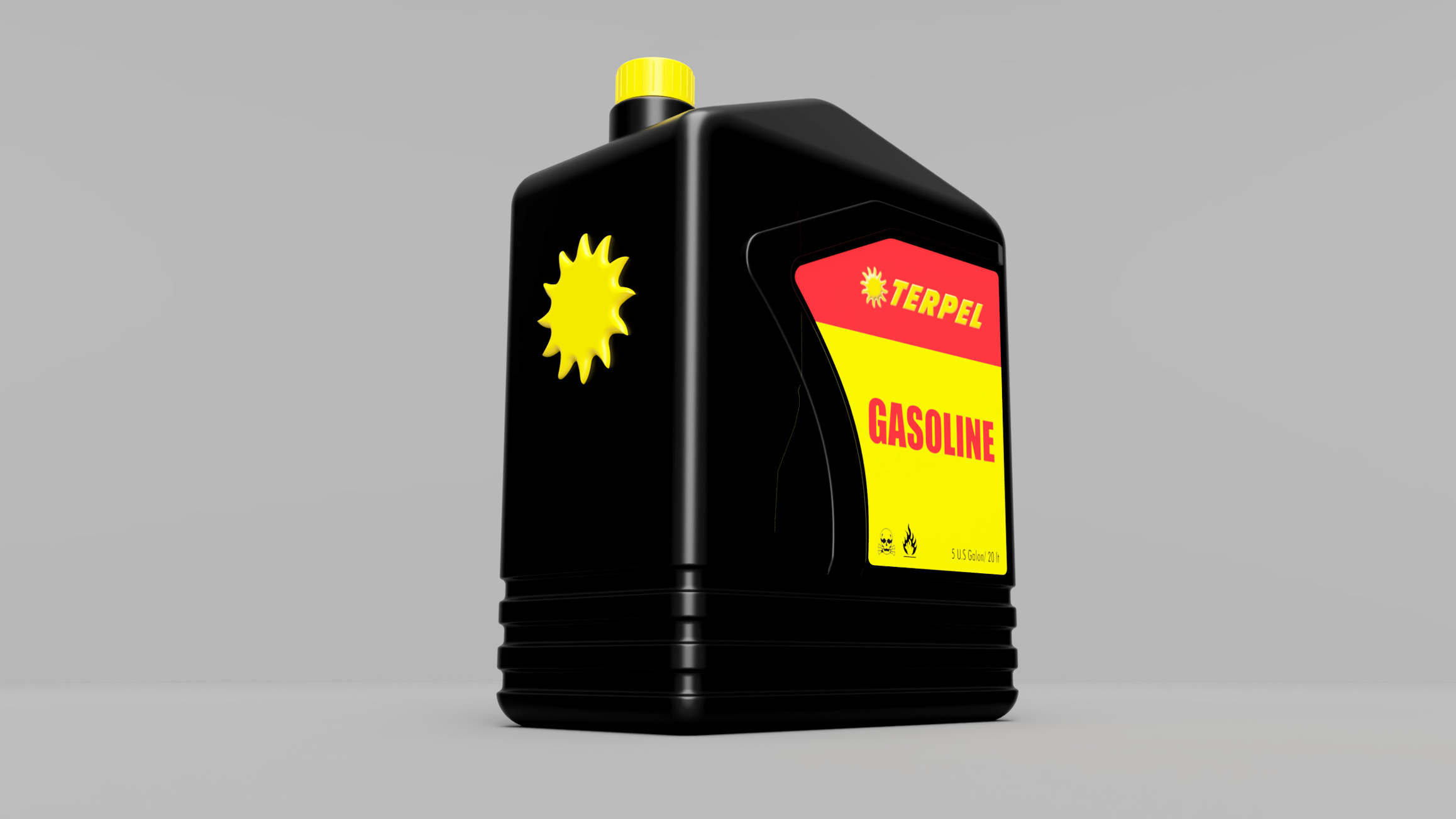
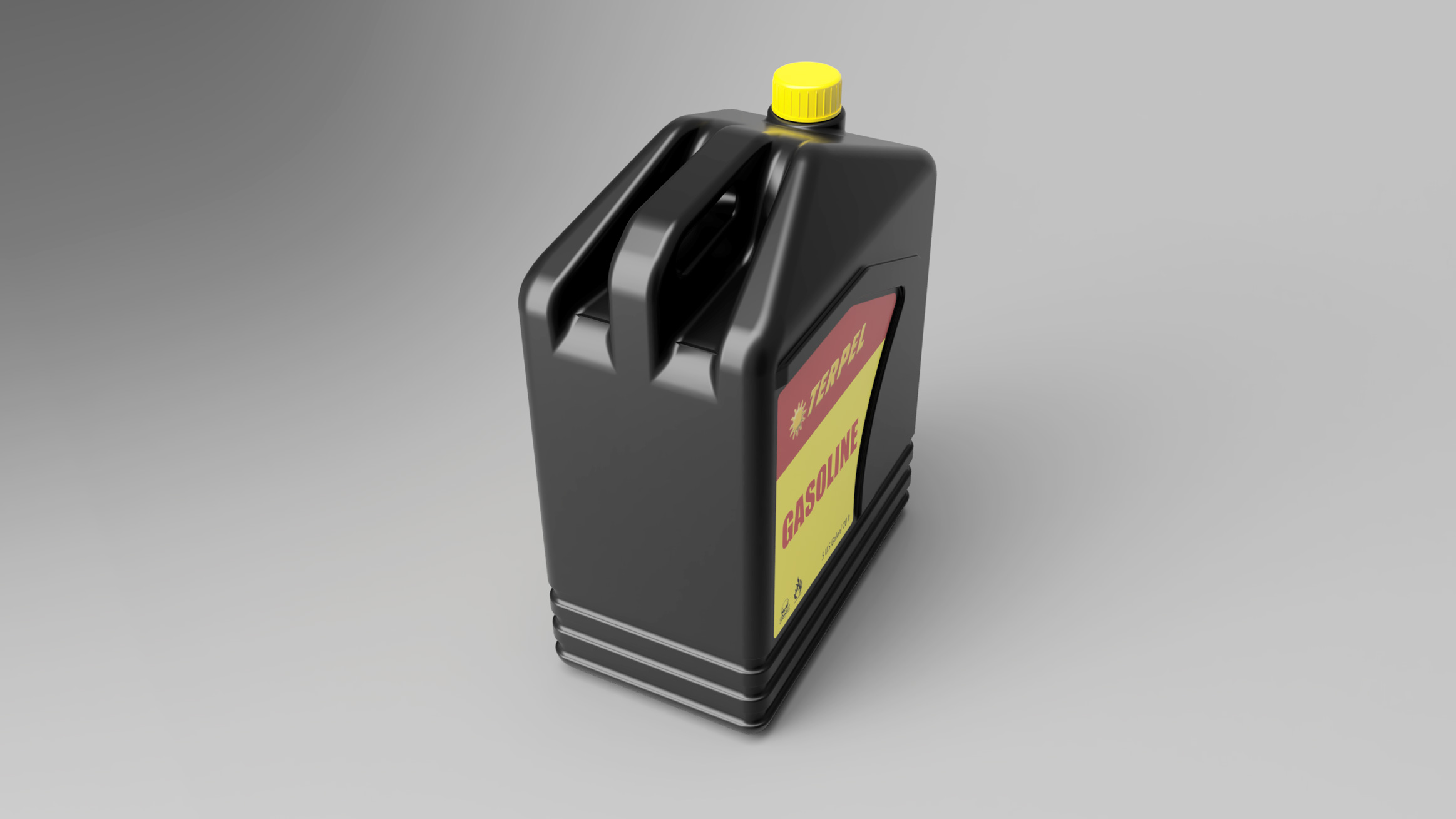
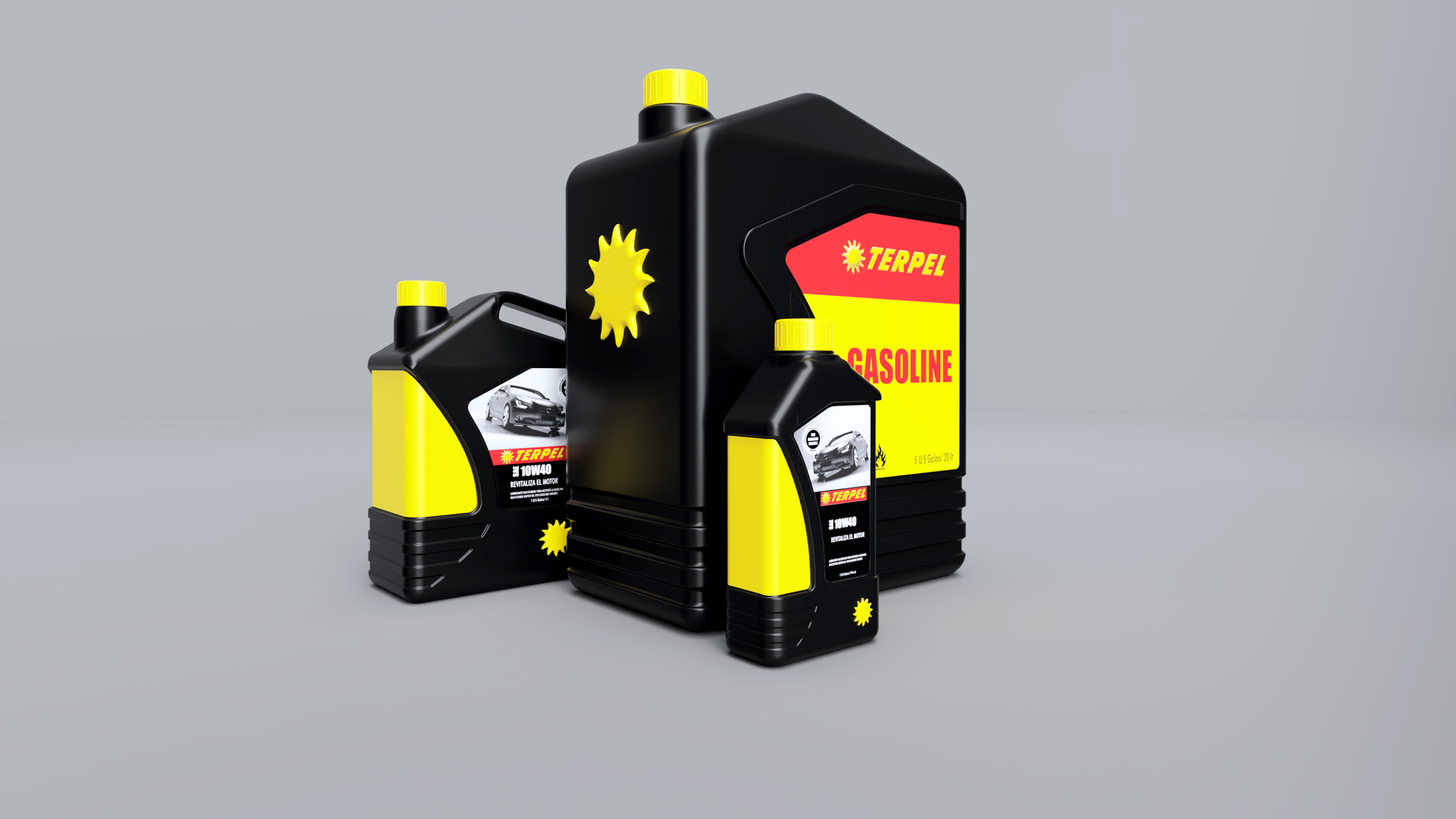
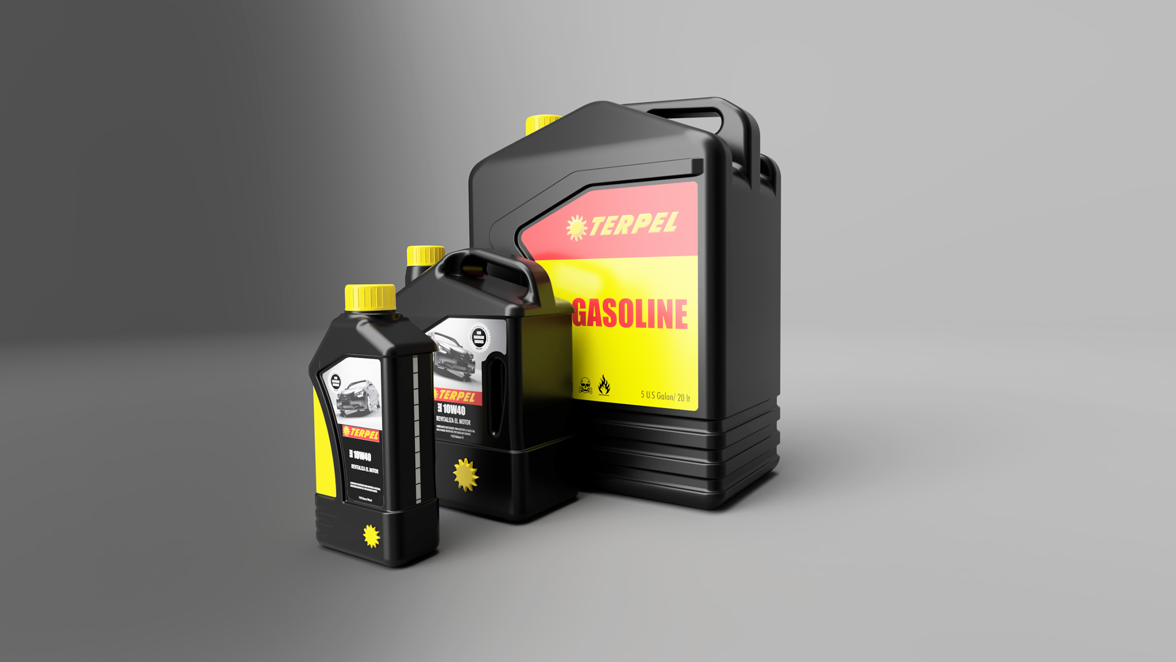
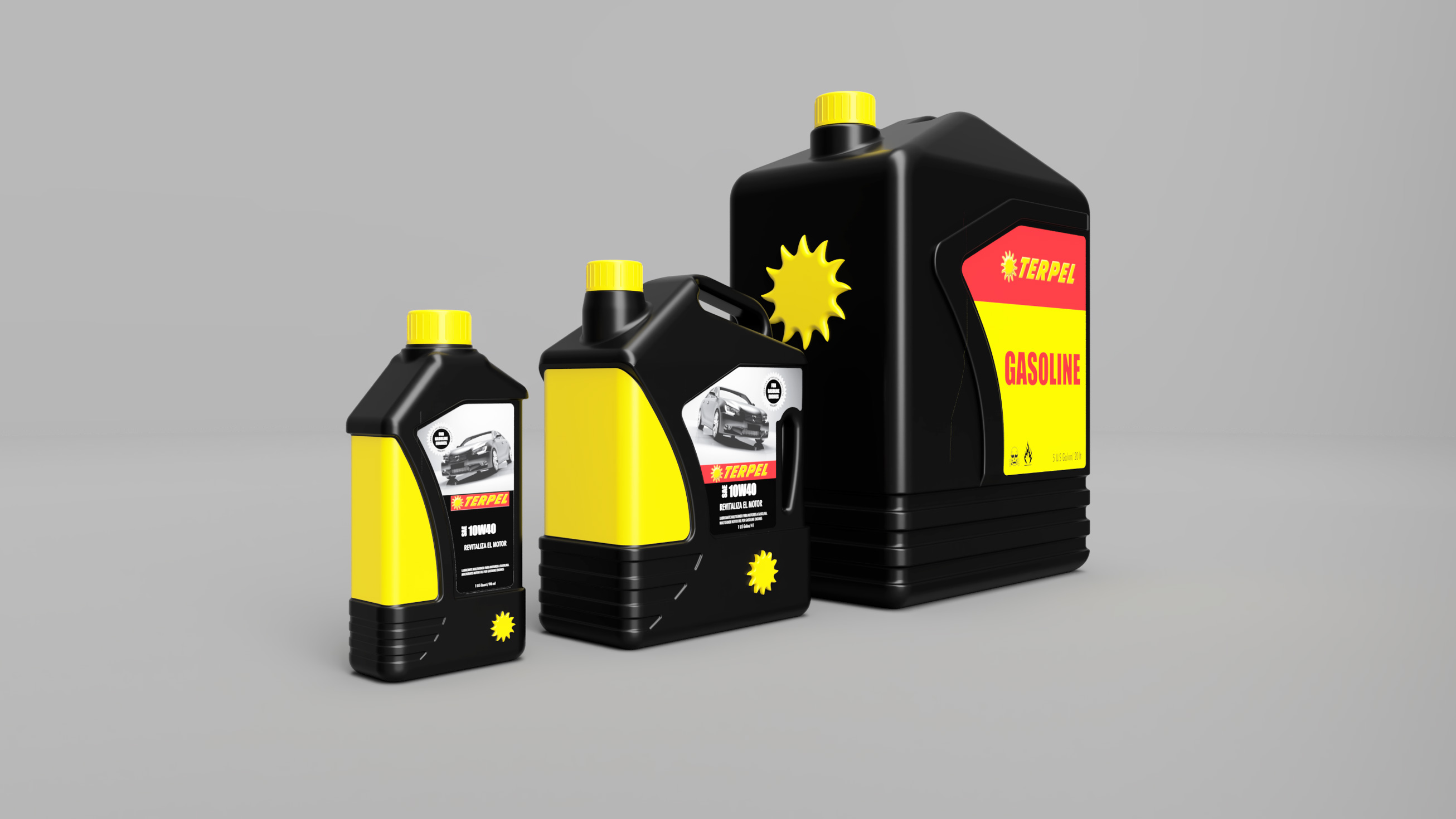
- Industrial Design
- Graphic Design
- Transportation Design
- Clay Modeling
- Restorations
- Scale Models
- Aircraft
- A-10 Thunderbolt II. 1:48
- Lockheed C-130 Hercules. 1:72
- Douglas DC-3. 1:72
- McDonnell Douglas F-4C Phantom II. 1:72
- McDonnell Douglas F-4J Phantom II. 1:72
- Top Gun Maverick’s F-14A Tomcat. 1:48
- Grumman F-14A Tomcat. 1:48
- Grumman F-14A Tomcat. 1:72
- McDonnell Douglas F-15 Eagle 1:72
- General Dynamics F-16 Fighting Falcon. 1:72
- Maverick’s F/A-18E Super Hornet. 1:48
- Stealth F-19 -Fighter. 1:72
- Lockheed F-22 A Raptor 1:72
- Lockheed F-104 Starfighter 1:72
- F-117 Nighthawk Stealth Fighter. 1:72
- Lockheed Martin SR-71 Blackbird. 1:72
- Lockheed YF-12. 1:72
- Bell Boeing V-22 Osprey. 1:48
- Panavia Tornado ECR “Tigermeet”. 1:72
- Armor Vehicles / Military
- Automobiles
- 1985 Chevrolet Camaro Z28 1:24
- 2013 Camaro ZL1. 1:24
- 2008 Dodge Challenger SRT8 1:25
- The Dukes of Hazzard “General Lee” Dodge Charger 1969. 1:25
- Dremel Grand-Prix Model. 1:24
- 1967 Ford Mustang GT Fastback 1:25
- Ferrari Enzo. 1:24
- Lamborghini Countach LP 500S. 1:24
- Mercedes-Benz CLK GTR. 1:24
- Mustang GT 2005. 1:25
- Nissan King Cab Monster Truck 1:32
- Volkswagen T1 “Samba Bus”. 1:24
- Dioramas
- Helicopters
- Motorcycles
- WWI & WWII
- Ships
- Space & Aerospace
- Star Wars
- Aircraft
- Teaching
- Contact


- Home
- About me
- Industrial Design
- Graphic Design
- Transportation Design
- Clay Modeling
- Restorations
- Scale Models
- Aircraft
- A-10 Thunderbolt II. 1:48
- Lockheed C-130 Hercules. 1:72
- Douglas DC-3. 1:72
- McDonnell Douglas F-4C Phantom II. 1:72
- McDonnell Douglas F-4J Phantom II. 1:72
- Top Gun Maverick’s F-14A Tomcat. 1:48
- Grumman F-14A Tomcat. 1:48
- Grumman F-14A Tomcat. 1:72
- McDonnell Douglas F-15 Eagle 1:72
- General Dynamics F-16 Fighting Falcon. 1:72
- Maverick’s F/A-18E Super Hornet. 1:48
- Stealth F-19 -Fighter. 1:72
- Lockheed F-22 A Raptor 1:72
- Lockheed F-104 Starfighter 1:72
- F-117 Nighthawk Stealth Fighter. 1:72
- Lockheed Martin SR-71 Blackbird. 1:72
- Lockheed YF-12. 1:72
- Bell Boeing V-22 Osprey. 1:48
- Panavia Tornado ECR “Tigermeet”. 1:72
- Armor Vehicles / Military
- Automobiles
- 1985 Chevrolet Camaro Z28 1:24
- 2013 Camaro ZL1. 1:24
- 2008 Dodge Challenger SRT8 1:25
- The Dukes of Hazzard “General Lee” Dodge Charger 1969. 1:25
- Dremel Grand-Prix Model. 1:24
- 1967 Ford Mustang GT Fastback 1:25
- Ferrari Enzo. 1:24
- Lamborghini Countach LP 500S. 1:24
- Mercedes-Benz CLK GTR. 1:24
- Mustang GT 2005. 1:25
- Nissan King Cab Monster Truck 1:32
- Volkswagen T1 “Samba Bus”. 1:24
- Dioramas
- Helicopters
- Motorcycles
- WWI & WWII
- Ships
- Space & Aerospace
- Star Wars
- Aircraft
- Teaching
- Contact


This website uses cookies to improve your browsing experience, provide analytics, and ensure the proper functioning of this website.
By clicking “Accept”, you consent to the use of all cookies. please see my Privacy Policy for more information.
.